

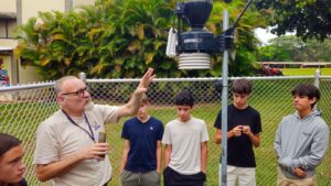
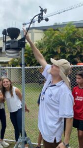
Finally as part of sustainability week I worked with all the 7th grade students explaining them how our Davis Weather Station works, seeing it in action and analysing the raw data that it collects. I linked this to an in-progress Walter Leith Climate Diagram that was used to explain how climate data could be shown, and charts generated by the weather station that showed links between different variables measured.
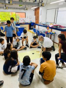
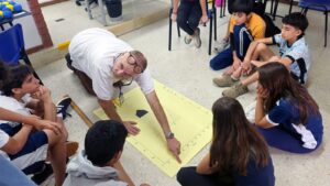
What surprised both Carolina Martínez and me, was how the students were more interested in the actual data related to their own environment than the physical equipment. They were hugely engaged, asking questions, interacting with the graph I produced such that I had to get on my hands and knees to explain them what they were seeing and learning. They then explored different climates in Colombia and the World using Climap (https://lnkd.in/eWYZ3XWn) all the while applying their new knowledge.
In short, bringing in knowledgable outside speakers, getting kids to work with relevant data to their own specific environment and letting them explore are enriching activities that are as important to their education as are our normal lessons.
Thank you to Jessica Gomez, Katie Neal and Carolina Martínez and the hashtag#BolivarSustainabilityWeek for making this happen!